10 Type Tidbits
From Lascaux to emojis, with a stop in Hell-vetica
It’s back to school time. So here’s some schooling, or re-schooling, as it pertains to type. A little type trivia if you will. My mantra is: stay curious.
This time, it was all about those fonts. From Lascaux and Gutenberg, to Comic Sans and emojis — with a stop in Hell-vetica along the way.
1. Type history in 140 characters.
Ceramic characters made in China in 1040. Gutenberg’s better version came in 1450. Typewriter, computers, now emojis? We’re back to Lascaux.
2. Why is it called Italic?
As pendulums swing, old/formal gothic typefaces gave way to the humanist spirit of the Renaissance (1300-1700s), producing a unique style of formal writing known as “cursiva humanistica.” This slanted and rapidly written style — which evolved in Italy — became a sort of cursive or italic typeface. Et, voila.
3. Origins of Helvetica?
In 1957, the original Helvetica was created by Swiss typeface designer Max Miedinger and Eduard Hoffmann. They were influenced by 19th century German and Swiss designs including the Haas foundry font called: Normal Grotesk.
The Linotype company soon adopted the font for widespread release as Neue Haas Grotesk (what we now know as Helvetica).
But in 1960, its name was changed, by Haas’ German parent company Stempel, to the more internationally marketable name of “Helvetica” (in Latin, Helvetica means “Swiss”).
Then, in 1983, a reworked version of that original 1957 staple was released, with a more unified set of heights and widths for the digital age, by D. Stempel AG with it's ‘new’ name: Helvetica “Neue” (in German, Neue means “new”).
Whew. Got it?
QUICK WAY TO SPOT HELVETICA:
As originally designed, the notable features of Helvetica include the termination of all strokes on exactly horizontal or vertical lines and unusually tight letter spacing. There, now you know.
WHY ARE THE INITIALS FOR SWITZERLAND: ‘CH’?
That stands for “Confoederatio Helvetica.” Helvetica = Switzerland. Another mystery solved.
4. Two reasons it earns the nickname HELL-vetica.
A) WHY AM I GETTING THESE FONT CONFLICTS ON SUCH A SEEMINGLY HARMLESS (EH-HEM... SWISS-NEUTRAL…), FONT??
Thanks to iOS7 or 10, somewhere along the line Mac thought it’d be cool to add in ‘Helvetica Neue’ to their system fonts. Great. Except... this causes a conflict with the version that you, Mr./Ms. Designer, very likely already have installed on your Mac. Argh. For the full monty on removing protected fonts check out their info: How to Disable Protected Fonts
B) HOW THE HELL DO YOU PRONOUNCE “NEUE”
Technically and accurately this word is pronounced “noy-a" or “noy-ay,” which is German for “new.” Good news is, we ALL are butchering it. Yay! Bad news is, we’re not very likely to adopt the correct pronunciation any time soon. It simply sounds to fruffy for your average American ears. Like why we say “Paris” instead of “Par-eee.” More likely, albeit incorrectly, we’ll continue to hear: Helvetica New or Helvetica New-ay (my incorrect pronunciation of choice).
5. Okay, not a typeface, but on pronunciations: .gifs? C’mon.
Invented by Steve Wilhite in 1987, if he wanted it pronounced Jif (which is completely fine), he should have spelled it: .jif. Or at least corrected all of us when it was introduced, not years later after we’ve been hard-G’ing it.
In 2012 it was named word of the year, and Mashable’s run down on it is spot-on.
And I'm still a hard-G user.
It’s gif. Not peanut butter.
6. Most popular letter of the alphabet?
The lowercase ‘e,’ is the most common letter in English and many other languages. Random. But you just re-scanned these sentences, didn’t you? And now you’re ready for Jeopardy.
7. What th’ font? TTF? OTF? PS/T1?
Honestly, this one is still a mystery to me. But from what I can gather, this is the hierarchy if you have to select.
1st – PostScript
2nd – TrueType
3rd – OpenType
Anyone have more insight? Leave a comment. I’m curious.
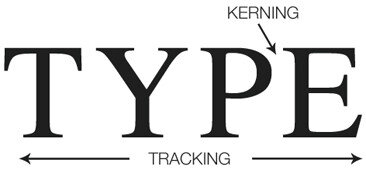
8. Kerning? Tracking? Which is which?
KERNING = individual, selective letter-spacing. Space adjustments between pairs of letters, usually in headlines. One size does not fit all [letters].
TRACKING = the overall letter-spacing, the adjustment of spacing for groups of letters, for entire blocks of text.
And, there you go.
KEYBOARD SHORTCUTS:
TIGHTER: Option + left arrow key
LOOSER: Option + right arrow key
9. Who created Comic Sans anyway? And why???
Yes, you know we had to go there. The year was 1994. Comic Sans was introduced by Vincent Connare and Microsoft. Supposedly inspired by comic book lettering, intended for use in informal documents and children’s educational materials. ONLY.
Backlash would be just a few years away. First by way of a 1999 “Ban Comic Sans” campaign.
Then, in 2010 after NBA superstar LeBron James left the Cleveland Cavaliers, in a highly publicized media affair. The owner of the team, Dan Gilbert, reacted by posting an angry, ranting letter to Cavalier fans. But while the letter was heavily mocked, it was less for the content and more about the font used in the angry letter — Comic Sans.
Type. Matters. People.
Choose your fonts wisely.
10. So what have we learned over 17,000 years of communication and type?
From cave communications, we’ve advance to 26 letters (give or take).
Then to many beautiful (and some scary, untracked/unkerned) typefaces.
Annnd, now we’re back to pictures? Sigh.
DROP A NOTE. LET’S GET IN TOUCH.


